Customizations (Settings Profiles)
From the Settings page, click the Settings Profile > Customizations.
 Customizations — Brushes
From the Settings page, click the Settings Profile > Customizations > Brushes.
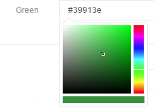
Clicking on the sample color icon next to the hex value will open a graphic color selector interface. Selecting a color in this interface will update the hex color in the textbox. The Alpha slider will change the opacity allowing background to be seen through the color.
| Name | Color in Hex | Opacity |
|---|---|---|
| black | #000000 | 100 |
| blue | #00A9E0 | 100 |
| buttonColor | #00A9E0 | 100 |
| gray1 | #0A0A0A | 100 |
| gray2 | #151515 | 100 |
| gray3 | #202020 | 100 |
| gray4 | #2A2A2A | 100 |
| gray5 | #343434 | 100 |
| gray6 | #3F3F3F | 100 |
| gray7 | #4A4A4A | 100 |
| gray8 | #545454 | 100 |
| gray9 | #5E5E5E | 100 |
| gray10 | #696969 | 100 |
| gray11 | #787878 | 100 |
| gray12 | #878787 | 100 |
| gray13 | #969696 | 100 |
| gray14 | #A5A5A5 | 100 |
| gray15 | #B4B4B4 | 100 |
| gray16 | #C3C3C3 | 100 |
| gray17 | #D2D2D2 | 100 |
| gray18 | #E1E1E1 | 100 |
| gray19 | #F0F0F0 | 100 |
| green | #3A913F | 100 |
| keyboardBackgroundColor | #000000 | 100 |
| keyboardCloseBtnColor | #00A9E0 | 100 |
| keyRollover | #75787B | 100 |
| keySelectColor | #75787B | 100 |
| red | #DC582A | 100 |
| stickyNoteBlue | #1E90FF | 100 |
| stickyNoteDarkYellow | #E5D57E | 100 |
| stickyNotePink | #FF1493 | 100 |
| stickyNoteYellow | #F9E992 | 100 |
| textColor | #00A9E0 | 100 |
| textColorOption1 | #FFFFFF | 100 |
| textColorOption2 | #000000 | 100 |
| textColorOption3 | #FF0000 | 100 |
| textColorOption4 | #00FF00 | 100 |
| textColorOption5 | #0000FF | 100 |
| textColorOption6 | #FFFF00 | 100 |
| theme | #00A9E0 | 100 |
| themeDark | #007FA5 | 100 |
| themeDarkLocked | #7C2522 | 100 |
| themeLocked | #FF2119 | 100 |
| white | #FFFFFF | 100 |
| yellow | #FFFF00 | 100 |
Customizations — Controls
From the Settings page, click the Settings Profile > Customizations > Controls.
The Control settings affect the side menu visibility and controls within Prysm assets.
| Setting | Definition | Data Type Needed | Default Value |
|---|---|---|---|
| Enable Context Menu on Both Sides | Toggles the side menu being seen on both sides of an asset. | ON/OFF | OFF |
| Enable Icon Only Context Menu | Toggles text labeling icons on side menu options. | ON/OFF | OFF |
| Auto Repeat Videos | Toggles videos restarting when they are finished. | ON/OFF | OFF |
| Auto Hide Video Controls | Toggles the video toolbar being hidden while the video is being played. | ON/OFF | ON |
| Delete Annotation Confirmation | Toggles a pop-up message asking users to confirm when they attempt to delete all annotations. | ON/OFF | ON |
| Show PDF Paging Arrows | Toggles arrows appearing on ALL multi-page/slide documents to change pages/slides. | ON/OFF | ON |
| Windows Touch keyboard Language | Sets the language that will be used on the Windows touch keyboard. | Dropdown | English (US) |
| Synthesis UI Localization | Sets the language that appears in the Prysm interface. | Dropdown | English (US) |
| Synthesis Keyboard Enabled | Toggles the use of the Prysm touch keyboard. If this setting is OFF, the Synthesis touch keyboard will not open. | ON/OFF | ON |
Customizations — Layouts
From the Settings page, click the Settings Profile > Customizations > Layouts.
Layout controls settings specifying background, logo, and margins.
| Setting | Definition | Data Type Needed | Default Value |
|---|---|---|---|
| Modal Margin | Padding left, top, right, and bottom for modals | left,top,right,bottom pixel margin | 0,0,0,0 |
| Logo Image | File path for the image file to be used as a logo | File path | pack://application:,,,/ Synthesis;component/Resources/ prysm_logo.png |
| Workspace Button Margin | Padding left, top, right, and bottom for workspace tray button | left, top, right, bottom pixel margin | 0,0,0,0 |
| Background File Path | File path for the image file to be used as a background | File Path | (C:\Synthesis\Resources\Background.jpg) |
| Logo Position Y | Position of the logo image on the vertical axis. Upper-left corner is reference point | Pixels | 30 |
| Logo Desired Width | Width of the logo image in pixels | Pixels | 350 |
| Logo Position X | Position of the logo image on the horizontal axis. Upper-left corner is reference point | Pixels | 30 |
| Show Logo | Toggles the logo being displayed | ON/OFF | ON |
| File Menu Top Margin | The margin above the file menu | Pixels | 0 |
| File Menu Desired Height | Sets the height of the File Menu in pixels | Pixels | 750 |
Customizations — Presentation Mode
From the Settings page, click the Settings Profile > Customizations > Presentation Mode.
These settings control toggling the Presentation Mode feature and the button opacity when it is enabled.
| Setting | Definition | Data Type Needed | Default Value |
|---|---|---|---|
| Annotation Button Toggled Icon Opacity | Sets the opacity of the annotation button in presentation mode when the button is pressed | 0 through 1 (including decimals. Ex. 0.72) | .6667 |
| Display Workspace Mode Toggle | Toggles user ability to activate Presentation Mode. This setting also requires the user to have the appropriate permission | ON/OFF | OFF |
| Annotation button Default Icon Opacity | Sets the opacity of the annotation button in presentation mode when the button has not been pressed | 0 through 1 (including decimals. Ex. 0.72) | .3334 |
| Annotation button Background Color | Sets the color of the annotation button’s background color | Hex color (color selector) | #000000 (Alpha slider=50) |
Customizations — Side Menus
From the Settings page, click the Settings Profile > Customizations > Side Menus.
Side menu settings specify the side menu options available per asset type. The following example shows the side menu options for Sticky Notes and for Text. To enable a side menu option, select the box.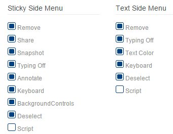
- The Script option is displayed in the side menu based on user permissions. It will not appear unless the user is in a permission group with
CanUseScripting selected. - The Bring to Front option is displayed if the settings profile uses a template that contains it.
Customizations — Snap Grids
From the Settings page, click the Settings Profile > Customizations > Snap Grids.
These settings control how assets react to Snap Grids and Snap Grid outlines.
| Setting | Definition | Data Type Needed | Default Value |
|---|---|---|---|
| Snap Grid Hover Animation Enabled | Toggles the Snap Grid outline when moving assets within a Snap Grid | ON/OFF | ON |
| Uses Snap Grid | Toggles the Snap Grid feature | ON/OFF | ON |
| Snap Grid Minimum Size Likeness Percentage | Minimum percentage an asset can to be (compared to the Snap Grid) before it can snap into the grid | Percentage | 70 |
| Snap Grid Maximum Size Likeness Percentage | Maximum percentage an asset can to be (compared to the Snap Grid) before it can snap into the grid | Percentage | 140 |
| Item and Region Area Likeness Threshold | Sets what percentage of an asset must be in a Snap Grid before it can snap into the grid | Percentage | 70 |
| Snap Grid Label Font Size | Sets the font size for the Snap Grid label | Point | 26 |
| Snap GridUnHovered Region Color | Sets the color of the Snap Grid outline when an asset is not being hovered within it | Hex color (color selector) | #ffffff (Alpha slider=25) |
| Snap Grid Hovered Region Color | Sets the color of the Snap Grid outline when an asset is being hovered within it | Hex color (color selector) | #faff3d (Alpha slider=81) |
Customizations — Pens
From the Settings page, click the Settings Profile > Customizations > Pens.
Pen settings enable you to customize the pixel thickness of each pen size: Small, Medium, Large, and Highlighter.
- Prysm Go also uses the pen thicknesses you customize.
- The default pen thicknesses (6, 10, 14, and 18 pixels) are optimized for 4k displays and shouldn't need to be customized.
- For displays with resolutions lower or higher than 4k, customizing pen thicknesses to smaller (for lower resolutions) or larger (for higher resolutions) thicknesses can give a better experience.
| Setting | Definition | Default Value |
|---|---|---|
| Highlighter | Set a thickness in pixels for the Highlighter pen. | 18 |
| Large | Set a thickness in pixels for the Large pen. | 14 |
| Medium | Set a thickness in pixels for the Medium pen. | 10 |
| Small | Set a thickness in pixels for the Small pen. | 6 |
Customizations — Touch
From the Settings page, click the Settings Profile > Customizations > Touch.
Touch settings affect how Prysm recognizes touch input. The default Touch Settings will vary depending on the type of display being used.
| Setting | Definition | Data Type Needed | Default Value |
|---|---|---|---|
| Enable Native Touch | Advanced setting dealing with how touch gets routed | ON/OFF | ON |
| Interactive Source Y Translation | This applies a translation on the y-axis of the point passed through to the interactive source | Pixel | 27 |
| Minimum Stage Item Height | Minimum height for all items opened | Percentage (1-100%) | 6 |
| Minimum Stage Item Width | Minimum width for all items opened | Percentage (1-100%) | 3 |
| Text Stage Item Minimum Font Height | Minimum font height within an asset. Based on percentage of canvas height. This is used in place of MinimumStageItemWidth and MinimumStageItemHeight | Percent | 2 |
| Touch Manipulation Threshold | Number of pixels a finger can roll over to and still be considered a tap gesture | Pixels | See Recommended Touch Settings. |
Recommended Touch Settings
The following table contains the recommended Touch Settings for each of the Prysm displays.
| Setting | Prysm 65/85/98 | Prysm 117/190 |
|---|---|---|
| Touch Manipulation Threshold | 60 | 12 |